This is a Communication Design project that I finished last year, but somehow forgot to post on here. Below is a quick design rationale that sums it all up nicely ...
 |
| front cover |
 |
| seeds |
 |
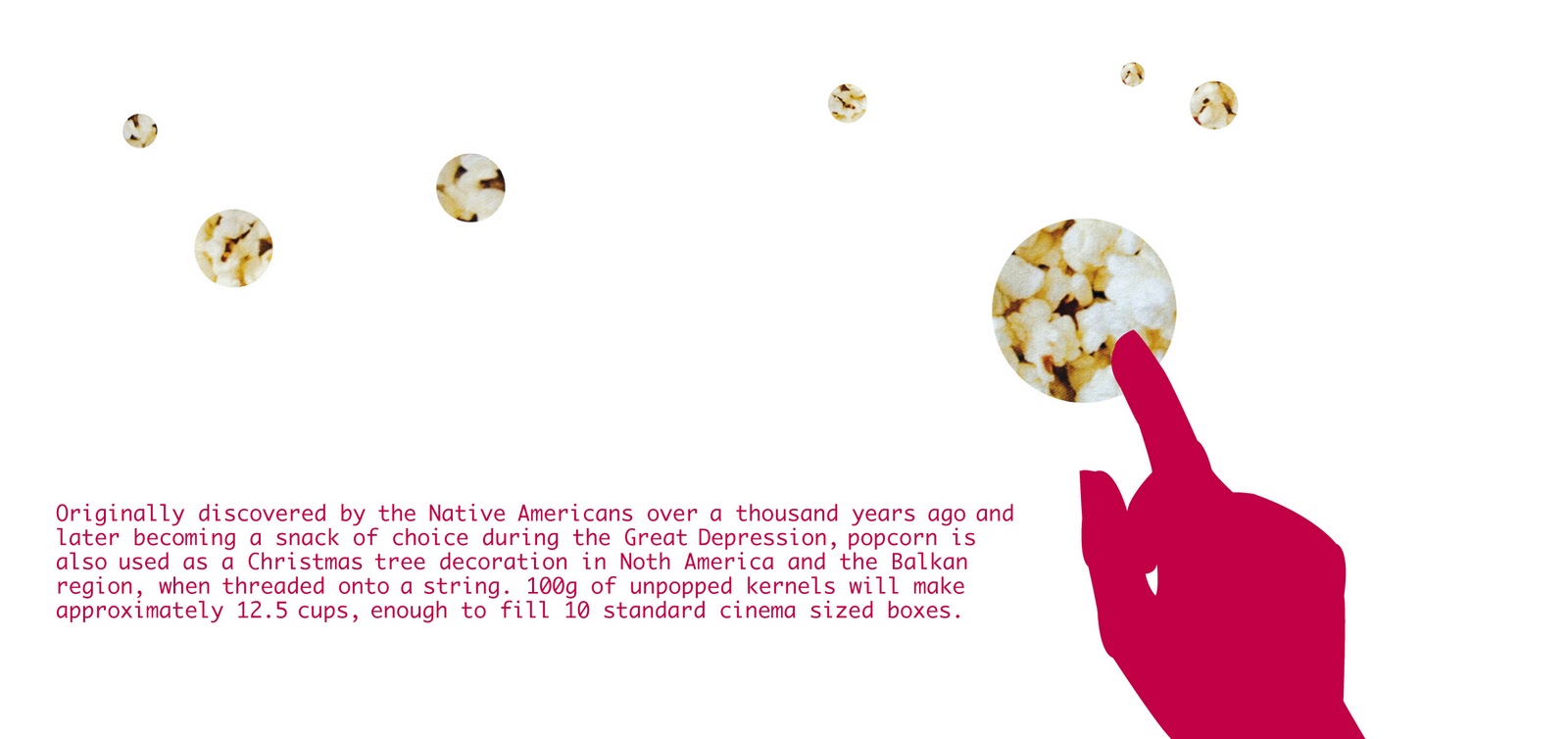
| popcorn |
 |
| butter |
 |
| matches |
 |
| painkillers |
 |
| wool |
 |
| laundry detergent |
 |
| copper sulphate |
 |
| ribbon |
 |
| back inside cover |
 |
| inside front cover |
 |
| back cover |
This publication is a real mixture of literal and conceptual design.
The theme and title is 100 grams, and is an investigation into 100 as a unit of measure, more specifically in weight/ grams.
The main focus is on the small and often overlooked everyday products and items that, when measured in 100g, take on very different and often interesting roles.
Working with 10 as a design tool, substances were chosen for their photographic (aesthetic) and reactions or effects when measured in 100g.
I chose to work in a square format, because 100 is a square number. Each 'page' (the booklet is in concertina form) measures 10 by 10 centimeters exactly, which then equals to 100 centimeters squared. I purposefully chose a very clean-cut and minimal illustration style, in order to showcase the substances clearly, with silhouettes of human hands to indicate the interaction that we have with each of the ten items.
There is, however, a twist – the hands are not using or interacting with the substances in a conventional manner, in fact they are doing things that would never normally be possible – which adds to the intrigue and makes these seemingly ordinary materials appear to be amazing.
From the outset, I wanted to create a design that was subtle but still playful and intelligent. The typography has also been kept very simple, in order to clearly communicate the message throughout the publication. The concertina format is also intended to add some playfulness to the publication.
Lastly, but most importantly, the finished design is printed on Sappi Reviva. Specifically chosen for “the difference it makes” - it is 100 percent recycled and 100 percent environmentally friendly, as well as being locally produced. Its natural texture and speckled finish work very well with the theme and overall design language used.