Wednesday, February 23, 2011

with Pen and Ink

This is one of my favourite books, not just "favourite design books", but favourite, best, books in general. It actually belongs to my dad, but he's kind of given it to me, so now it lives in my little bookcase - which is in desperate need of an upgrade, getting way too small!

I'm a huge fine of line drawings and this book is just full of amazing ones. At the moment we're busy with a drawing project that involves doing lots of drawings of various machines and tools, so here are some of my weak attempts compared to this amazing book...
Just please bear in mind that I did all of these freehand, no rulers, no erasers, nothing!

closed book

open book!

Kodak Brownie Holiday Flash Camera

Kodak Brownie Holiday Flash Camera - detail

fire extinguisher

Iron - tonal drawing in pencil

Iron - detail

 very old iron

very old iron - detail

Artograph Super Lens AG100 projector

Artograph Super Lens AG100 projector - detail

sieve

sieve - detail

sieve - detail

video tape - this got a bit stretched though!

Tuesday, February 22, 2011

100 grams

This is a Communication Design project that I finished last year, but somehow forgot to post on here. Below is a quick design rationale that sums it all up nicely ...

front cover

seeds


popcorn

butter

matches

painkillers

wool

laundry detergent

copper sulphate


ribbon
back inside cover

inside front cover

back cover


This publication is a real mixture of literal and conceptual design.
The theme and title is 100 grams, and is an investigation into 100 as a unit of measure, more specifically in weight/ grams.

The main focus is on the small and often overlooked everyday products and items that, when measured in 100g, take on very different and often interesting roles.  
Working with 10 as a design tool, substances were chosen for their photographic (aesthetic) and reactions or effects when measured in 100g.

I chose to work in a square format, because 100 is a square number. Each 'page' (the booklet is in concertina form) measures 10 by 10 centimeters exactly, which then equals to 100 centimeters squared.  I purposefully chose a very clean-cut and minimal illustration style, in order to showcase the substances clearly, with silhouettes of human hands to indicate the interaction that we have with each of the ten items.

There is, however, a twist – the hands are not using or interacting with the substances in a conventional manner, in fact they are doing things that would never normally be possible – which adds to the intrigue and makes these seemingly ordinary materials appear to be amazing.

From the outset, I wanted to create a design that was subtle but still playful and intelligent. The typography has also been kept very simple, in order to clearly communicate the message throughout the publication.  The concertina format is also intended to add some playfulness to the publication.


Lastly, but most importantly, the finished design is printed on Sappi Reviva. Specifically chosen for “the difference it makes” - it is 100 percent recycled and 100 percent environmentally friendly, as well as being locally produced. Its natural texture and speckled finish work very well with the theme and overall design language used.


Monday, February 21, 2011

Toffie time

my Toffie ticket pinned up on my notice board


Its almost a month left until the third Toffie festival takes place!

The line up sounds amazing and I'm super excited to be going - I bought my ticket last year already... Seriously looking forward to this, just wish that more of my friends were going... (hint hint everyone)

Sunday, February 20, 2011

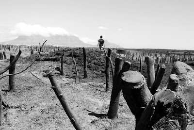
scorched earth policy


We're all busy with this Design History project about culture and interculture and cross-culturalisationpollination fabrication etc. Basically this means that we are in groups of 4 and have to spend time at each other's houses, favourite places, eating each other's traditional food and sharing experiences ... I took these photographs yesterday while we were going for a walk around Anthony's side of town. It was a vlei behind his house and we got to a part that had been burnt down the previous day ...

I was just playing around with my Nikon and some low angles, trying to make the two subjects look like giants, but maybe they look more like miniature model people from a train set or architectural model?

kiss you on the cheek


I took these photos this morning - someone very special to me doing something that he loves, and I love to just listen and watch him - makes me feel happy and warm inside.
(He's probably going to be cross with me for putting these up, but I don't mind!)

Friday, February 18, 2011


Here is the logo that goes with the packaging project that I just completed. The name, Intwasa, means "the calling" that one gets from the ancestors, summoning them to become a Sangoma or traditional healer.  

The logo design is directly inspired by the wildebeest tail swish that Sangomas use in their rituals - both by the hair of the tail and the swishing motion it creates. 

The type was all done by hand and is meant to loosely represent bones that are also used in ritual "throwing of the bones" ceremonies and the hair of the wildebeest tail as well.

Quite a simple logo, but  I think it's also pretty effective!

(I will post the rest of the packaging design very soon!)

Monday, February 14, 2011

Tea cures everything

i love this photo of these Victorian styled ladies!

I think I must be going slightly mad - for the first time ever last night I did something that I always thought completely unthinkable, impossible, too ridiculous to even imagine ...

I did some design history homework instead of prac work (logo design for a packaging and market research project, focusing on Sangomas - which is actually pretty fun and interesting)!


and I actually kind of enjoyed it ... 
gasp! What's wrong with you, Sawyer!


Anyway, here are some of the pictures that I made to accompany a little brief on traditional English Afternoon Tea, for my three group members who are coming to my house on Friday for some tea and scones and cucumber sandwiches and whatever else goes down well with tea.  Hope you appreciate this, group 3! haha, only joking...


Alright, no more procrastinating... lets get back to that packaging project!

      and this is a picture that i took in Covent Garden last October - think it goes nicely with this project!

happy valentines everyone