Showing posts with label collage. Show all posts
Monday, April 30, 2012
editorial
Some quick and silly doodles I did in my new magazine that I bought to pass the time this long long weekend! It's nice to be drawing again, even if it's just something basic like this. I know these drawings are weird, don't judge me ok!
Saturday, February 11, 2012
oh would you just look at that
Friday, February 3, 2012
flower crown
Ok, so here is the first "style" post on this blog ever I think. These flower crowns are so cool, I guess I just feel this way because I'm really quite a hippie inside and often wish I could have been my age now in the 60's.
All image sources here.
Thursday, November 24, 2011
take me to the mountains
It's nearly, nearly, that time of year again - camping time! I can't wait...
I made this collage out of photos from the previous three camping trips that Steve and I have been on. We discovered Jamaka Organic Farm in December 2009 and have been going back ever since. This is honestly the best campsite I've ever been to. Each spot is really private, secluded by trees and bushes, so even though it's in the middle of the hot hot Cedarberg, it's still nice and shady. There is an amazing rock pool to swim in and all the camp sites are along the river. Such a beautiful place.
For reservations, contact Jannie or Katrin Nieuwoudt via their website
I made this collage out of photos from the previous three camping trips that Steve and I have been on. We discovered Jamaka Organic Farm in December 2009 and have been going back ever since. This is honestly the best campsite I've ever been to. Each spot is really private, secluded by trees and bushes, so even though it's in the middle of the hot hot Cedarberg, it's still nice and shady. There is an amazing rock pool to swim in and all the camp sites are along the river. Such a beautiful place.
For reservations, contact Jannie or Katrin Nieuwoudt via their website
Monday, September 19, 2011
home is where the coffee is
A little bit of what I've been up to lately... This is the cover of a proposal document and the accompanying mood board that my friend, Lisa Nelson and I submitted for the NoKak Eco Design Competition.
The brief required us to come up with anything that is sustainable and environmentally friendly - could be a product or a campaign or anything really!
So we came up with a campaign to discourage the use of polystyrene cups in our college's cafeterias, by encouraging the use of reusable, ceramic mugs and highlighting the dangers of polystyrene as a food container. Polystyrene really is a terrible material, it is incredibly harmful to the environment and after doing some research, we were shocked that it is still so widely used in the food industry.
UPDATE: We made it through to the finals! This is rather nice news, because it means that our work will be part of a traveling exhibition, that will be in South Africa and Sweden. We also have a chance to win a (three-week, i think) trip to Sweden next year! So a lot of hard work lies ahead of us, but lets hold thumbs that we make it!
The brief required us to come up with anything that is sustainable and environmentally friendly - could be a product or a campaign or anything really!
So we came up with a campaign to discourage the use of polystyrene cups in our college's cafeterias, by encouraging the use of reusable, ceramic mugs and highlighting the dangers of polystyrene as a food container. Polystyrene really is a terrible material, it is incredibly harmful to the environment and after doing some research, we were shocked that it is still so widely used in the food industry.
UPDATE: We made it through to the finals! This is rather nice news, because it means that our work will be part of a traveling exhibition, that will be in South Africa and Sweden. We also have a chance to win a (three-week, i think) trip to Sweden next year! So a lot of hard work lies ahead of us, but lets hold thumbs that we make it!
Labels:
collage,
craft,
data visualisation,
paper cut-outs,
photography,
sustainability
Thursday, September 1, 2011
wet spring day
It's the first day of spring and most people in Cape Town have been complaining, I'm doing a little dance, because I love the rain! If I could I would probably move to a permanently-wintery country...
Sunday, May 15, 2011
oblivious

Something from my new visual diary - a different take on mental illness
_________________________________
Tuesday, May 3, 2011
Team photos
We're all busy working on a nine-week group project that basically involves creating a campaign for a Non Government Organisation (NGO) and then entering that campaign into the Sappi Ideas That Matter competition. Exciting stuff. I was in a mood to procrastinate last night, so I took pieces of each of our group's faces and mashed them up to create this thing! I'm calling him/her/it JAAR - Jared, Aimee, Arno and Renate. Ok, back to work!
Friday, April 22, 2011
Monday, April 18, 2011
wet ink
I found one of my old paint palettes in class today and it still had some nice designer's colours left in it from last time. So I had some fun in my new pocket sketchbook...
| palette |
![]() |
| drawing number 1 |
![]() |
| drawing number 2! |
Tuesday, February 22, 2011
100 grams
This is a Communication Design project that I finished last year, but somehow forgot to post on here. Below is a quick design rationale that sums it all up nicely ...
![]() |
| front cover |
![]() |
| seeds |
![]() |
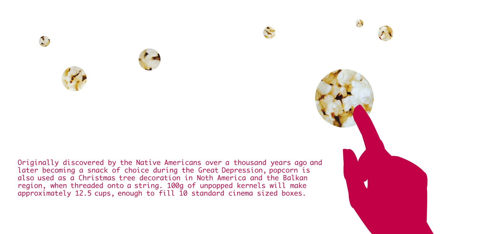
| popcorn |
![]() |
| butter |
![]() |
| matches |
![]() |
| painkillers |
![]() |
| wool |
![]() |
| laundry detergent |
![]() |
| copper sulphate |
![]() |
| ribbon |
![]() |
| back inside cover |
![]() |
| inside front cover |
![]() |
| back cover |
This publication is a real mixture of literal and conceptual design.
The theme and title is 100 grams, and is an investigation into 100 as a unit of measure, more specifically in weight/ grams.
The main focus is on the small and often overlooked everyday products and items that, when measured in 100g, take on very different and often interesting roles.
Working with 10 as a design tool, substances were chosen for their photographic (aesthetic) and reactions or effects when measured in 100g.
I chose to work in a square format, because 100 is a square number. Each 'page' (the booklet is in concertina form) measures 10 by 10 centimeters exactly, which then equals to 100 centimeters squared. I purposefully chose a very clean-cut and minimal illustration style, in order to showcase the substances clearly, with silhouettes of human hands to indicate the interaction that we have with each of the ten items.
There is, however, a twist – the hands are not using or interacting with the substances in a conventional manner, in fact they are doing things that would never normally be possible – which adds to the intrigue and makes these seemingly ordinary materials appear to be amazing.
From the outset, I wanted to create a design that was subtle but still playful and intelligent. The typography has also been kept very simple, in order to clearly communicate the message throughout the publication. The concertina format is also intended to add some playfulness to the publication.
Lastly, but most importantly, the finished design is printed on Sappi Reviva. Specifically chosen for “the difference it makes” - it is 100 percent recycled and 100 percent environmentally friendly, as well as being locally produced. Its natural texture and speckled finish work very well with the theme and overall design language used.
I chose to work in a square format, because 100 is a square number. Each 'page' (the booklet is in concertina form) measures 10 by 10 centimeters exactly, which then equals to 100 centimeters squared. I purposefully chose a very clean-cut and minimal illustration style, in order to showcase the substances clearly, with silhouettes of human hands to indicate the interaction that we have with each of the ten items.
There is, however, a twist – the hands are not using or interacting with the substances in a conventional manner, in fact they are doing things that would never normally be possible – which adds to the intrigue and makes these seemingly ordinary materials appear to be amazing.
From the outset, I wanted to create a design that was subtle but still playful and intelligent. The typography has also been kept very simple, in order to clearly communicate the message throughout the publication. The concertina format is also intended to add some playfulness to the publication.
Lastly, but most importantly, the finished design is printed on Sappi Reviva. Specifically chosen for “the difference it makes” - it is 100 percent recycled and 100 percent environmentally friendly, as well as being locally produced. Its natural texture and speckled finish work very well with the theme and overall design language used.
Monday, February 14, 2011
Thursday, December 9, 2010
Playing with pencil crayon
I can't remember the last time I did an illustration with pencil crayon, must have been sometime in junior school! So last night I decided to give it a go and I think it went quite well! I really love working in different shades of just one colour and pencil crayon is a great medium for that.
| using the watercolour pencil crayon, i made a kind of collage drawing in my sketchbook |
| A detail shot of some washes made by mixing the pencil shavings with water |
Monday, June 21, 2010
visual diary
- most of all i love the ribbon type that says "Miss Dior" - so pretty!
Since starting college last year, i have been finding it harder and harder to find the time to do 'my own stuff' and after a more than a year of feeling the pressure something else has happened - i have lost 'my own style'!
So i made a decision to try my very hardest to find it again, which is why i made this visual diary and hopefully i will be able to fill its almost-square shaped pages with something new each day of our six-week winter holiday. Above is a drawing/collage from a few days ago....
cut cut stick stick
Here are some collages that i made - some more recent than others!
The first one was just for fun...
Subscribe to:
Posts (Atom)