Showing posts with label publishing. Show all posts

Saturday, August 6, 2011

Saturday Progress

Adam Hill

Alex Trochut

Daito Manabe

Erik Spiekermann

Jonathan Puckey

Marta Cerdà Alimbau

Siggi Eggertsson
Some portraits that I've just done - For a publication project that is due in on Monday. Will post the whole thing once it's done!

Saturday, July 2, 2011

long time no blog, so here's a nice long post


_______________

I have really been neglecting this blog lately, just because so much has been going on.
The Sappi project is over at last, but things have been still been pretty chaotic. But i mean that in a great way, good chaos!

i moved into a much smaller room, so had a big decluttering, dejunking, proper and much-needed clearout. Then it was time to submit our portfolios for midyear assessment at tech, then it was the start of a three week holiday, but it wasn't really a holiday because of all the assignments we were given.

I have also been spending time at one of the country's best advertising agencies, The Jupiter Drawing Room, for the past week and a half, as part of our industry placement project. I've really been enjoying it there and will be a little sad to leave. It's a very inspiring place, filled with great people. Everyone I've met so far has been nice to me and I''ve been able to work on some great projects. Their in-house illustrator is away on holiday, so I've been filling in for him. I'm really in my element there, because it means that all i have to do is draw all day! I've also been working with a copywriting intern on another project, which we will be showing to the client later this week, so I think I've really gained some very valuable experience.

We have to write a comparative report, comparing two different studios, agencies or designers, so next week I will be visiting a freelance graphic designer and illustrator, whose work i have admired for quite some time, so I'm very excited about that as well!

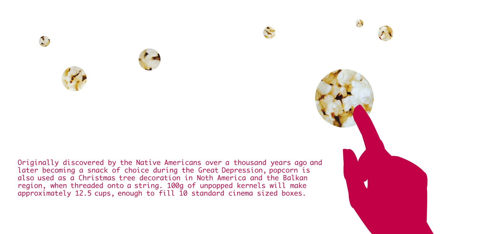
We also have to write an article and take some photographs for a design magazine of our choice, and then design the layout, write the copy and take the photos in the style of that magazine. This needs to be nearly done by the time we go back to tech in two Monday's time. I'm going to go with It's Nice That or Creative Review, but haven't fully decided yet.


Phew! With so much going on, I think I should take up smoking to curb the stress.
No no, only joking!

______________  _  _______________


ps. smoking lady image is from scotch & scones

Tuesday, February 22, 2011

100 grams

This is a Communication Design project that I finished last year, but somehow forgot to post on here. Below is a quick design rationale that sums it all up nicely ...

front cover

seeds


popcorn

butter

matches

painkillers

wool

laundry detergent

copper sulphate


ribbon
back inside cover

inside front cover

back cover


This publication is a real mixture of literal and conceptual design.
The theme and title is 100 grams, and is an investigation into 100 as a unit of measure, more specifically in weight/ grams.

The main focus is on the small and often overlooked everyday products and items that, when measured in 100g, take on very different and often interesting roles.  
Working with 10 as a design tool, substances were chosen for their photographic (aesthetic) and reactions or effects when measured in 100g.

I chose to work in a square format, because 100 is a square number. Each 'page' (the booklet is in concertina form) measures 10 by 10 centimeters exactly, which then equals to 100 centimeters squared.  I purposefully chose a very clean-cut and minimal illustration style, in order to showcase the substances clearly, with silhouettes of human hands to indicate the interaction that we have with each of the ten items.

There is, however, a twist – the hands are not using or interacting with the substances in a conventional manner, in fact they are doing things that would never normally be possible – which adds to the intrigue and makes these seemingly ordinary materials appear to be amazing.

From the outset, I wanted to create a design that was subtle but still playful and intelligent. The typography has also been kept very simple, in order to clearly communicate the message throughout the publication.  The concertina format is also intended to add some playfulness to the publication.


Lastly, but most importantly, the finished design is printed on Sappi Reviva. Specifically chosen for “the difference it makes” - it is 100 percent recycled and 100 percent environmentally friendly, as well as being locally produced. Its natural texture and speckled finish work very well with the theme and overall design language used.